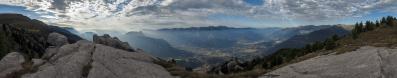
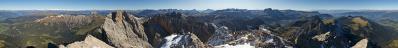
Fravort   42884
vorheriges Panorama
nächstes Panorama
Himmelsrichtungen ein / ausHimmelsrichtungen ein / aus
Details / LegendeDetails / Legende Marker ein / ausMarker ein / aus Übersicht ein / ausÜbersicht ein / aus   
 Durchlauf:   zum ersten Punkt zum vorherigen Punkt Durchlauf abbrechen
Durchlauf starten
Durchlauf anhalten
zum nächsten Punkt zum letzten Punkt
  verkleinern
 

Legende

1 Carè Alto, 3462
2 Cima Tosa, 3173
3 Cima Brenta, 3150
4 Dosso di Costalta, 1955
5 Oltmon, 2220
6 Rujoch, 2432
7 Gronlait, 2383
8 Cima Cece, 2754
9 Cimon della Pala, 3184
10 Cimadasta, 2847
11 Cima Trento, 2530
12 Sass de Mura, 2547
13 Pavione, 2334
14 Grigno, 260
15 Borgo Valsugana, 380
16 Cima Dodici, 2334
17 Poisele, 1000
18 Portule, 2307
19 PASUBIO, 2234
20 Panarotta, 2002
21 MONTE BALDO, 2218
22 Altissimo di Nago, 2078

Details

Aufnahmestandort: Fravort (2347 m)      Fotografiert von: Pedrotti Alberto
Gebiet: Fleimstaler Alpen      Datum: 02-02-2015
On the ascent n.178 to the Fravort, my home mountain, I have decided to shoot my first 360° panorama from the summit.

22 HF, Canon G1X, 68 mm equiv, ISO 100, f/5.6, 1/125 sec.

Kommentare

Such a nice pano, with no comments so far. Unfortunately, I know nothing about the area, so can't really add any smart words either. Cheers, Martin
08.02.2015 17:45 , Martin Kraus
Martin: your comment would have been welcome even if empty, because I was thinking of you while working at this. Namely, in a comment of some time ago you wrote me down a primer about experimenting with colour profiles, spending good words for the Neutral one. And here, actually, for the first time I abandoned Standard to try out Neutral. To be honest, I am not that satisfied, but this may also happen because 1) as said, this is the very first experiment and 2) my eye is now used to dozens of works prepared the other way.
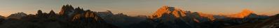
On my screen, it is especially the NW section to come out with a strange hue. Somewhat better news are found at SO.
Cheers, Alberto.
09.02.2015 17:47 , Pedrotti Alberto
@Alberto - thanks for reminding me of my own words. I have still not understood colour profiles in Lightroom, I just see amazing differences. With my Olympus, I now mainly use "Camera Natural" - only for portraits, I find the skin tones much more natural with "Adobe Standard" and neither with "Camera Natural" or even "Camera Portrait". There must be a funny job for someone to come up with theses irritating names... As for the present pano, the colors are nice, if tending a very slight inch into the "kitschy" - any serious judgement whether this is an affect of the profile however needs a comparision of all available alternatives, which would blow up this platform.
Anybody out there who can provide more insight on what is really happening here?
Cheers, Martin
09.02.2015 20:33 , Martin Kraus
A me piace tantissimo così come è.
09.02.2015 23:12 , Giuseppe Marzulli

Kommentar schreiben


Pedrotti Alberto

Weitere Panoramen

... in der Umgebung  
... aus den Top 100