|
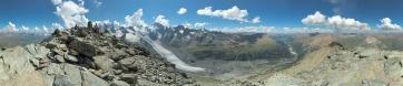
Ich zeige hier zwei Bildbearbeitungen, welche mehr oder weniger ident sind. Die Unterschiede sind dennoch frapant und zeigen, in welchem Ausmaß die Firmware der Hersteller der Kameras auf unser Sehverhalten Einfluss nimmt.
Aufnahmezeitpunkt: 14:27 MEZ
Ausgangsmaterial:
30 HF RAWs mit Canon 550D, Sigma 17-70 @ 34 mm, f/9, 1/160-1/500 (Fixblende). Stativ, NPA.
Bearbeitung: DPP, Hugin, Gimp.
DPP: Leichtes Schärfen, Bildart (Canon-Begriff): NEUTRAL, Ausgabe als 8 Bit TIFF
Hugin: Anker in Bildmitte, LDR ohne WAB. Ausgabe als TIFF
Gimp: Beschnitt, Skalierung, Tonwertkorrektur über Weiß- / Schwarzpunkt und Gamma Abgleich (6, 250, 1.10), Nachschärfen.
|
 |


Comments
lG,
J
(Über dem Inntal war ich heute auch schon...)
Ich fotographiere ja immer mit der Bildart (picture style) NEUTRAL, vielleicht weil ich Österreicher bin, eher aber, weil ich das Bild so im File haben möchte, wie es mir die Hard-Ware (Linse, Chip ...) vorgibt. Im Rahmen der Nachbearbeitung habe ich diesen "picture style" in den letzten Monaten nicht verlassen, eben aus dem selben Grund - weil ich eine gewisse Authentizität waren wollte.
Hier nun das Ergebnis ... Picture-Style NEUTRAL ...
urteilt selbst .... und vergleicht mit dem iPhone!
Link zu Hintergrund-Infos für die Styles: www.canon.co.jp/imaging/picturestyle/style/
Aber ein Bild ist eben nur ein Bild und kann das Gesehene nicht 1:1 wiedergeben, schon gar nicht in dieser Größe bzw. Auflösung.
Auf einem Foto geht immer ein Teil der tatsächlichen Stimmung verloren.
Deshalb finde ich es richtig, durch Bildbearbeitung Kontrast, Sättigung und Schärfe leicht anzuheben, daß z.b. auch der Hintergrund etwas klarer und deutlicher erkennbar wird als es in Natura vielleicht zu sehen war.
Das I-Phone-Bild: Nicht schlecht für ein Telefon ;-) die Bildqualität kann sicher mit mancher Kompaktkamera mithalten. Fehlt nur eine integrierte Wasserwaage für einen geraden Schwenk
VG Manfred
In jedem Fall ein sehr schöner Standort und gut gewählter Bildaufbau!
Herzliche Grüße
Hans-Jörg
In DPP, if you click on "toolpalette", you have 3 sections: RAW, RGB and NR/Lens/ALO. If you click on NR/Lens/ALO you will find (at least by me) Automatic Light Optimizer switched on. That means, that your picture gets a pre-treatment of contrast. Especially morning/evening that will give different luminance in a clear sky, in the pictures in a pano-series, but will not be so obvious when the sky is clouded. Now, this feature is a little unpredictable - it sort of aims at a fixpoint, and therefore, a pale picture will get more contrast, whereas pictures with stronger contrast will be "de-contrasted". Like so many things it can be helpful in the beginning, but working in GIMP I prefer to make my own personal contrastcurve. So, my question is: is ALO switched on or off when makin these series?
PS: I think the landscapeversion is more clear and vivid, and it shows that it works good on: Bright daylight and inlandscenery. However, by the sea and with the sun standing low it looks chemical and over the top. Neutral, combined with a custom-made contrast-curve in GIMP, is my favorite. LG Jan.
ALO was switched off in both series - I think it generally does not make sense to do some automatic contrast enhancement at this step of the process. I am also well aware, that a rather flau "neutral" series can be transformed to a more vivid one by applying a customized "tonwert-kurve" in GIMP or any other comparable program. For me, this was not the point in this picturer pair, I wanted to express my general concerns regarding the limitations of the picture production process.
Herzlichst Christoph
PS: I agree, "landscape" does not always work well (sometimes "portrait" is even better ...); you have to be very careful if you want to take this route of processing - I tend to leave it behind ...
Leave a comment